React Composition Patterns That Scale
Write React that stays clean: composition over props soup, the children prop, and lifting state up. Practical patterns with examples.

Every React project hits the same wall. A <Card> starts simple, then someone needs a title, so you add a title prop. Then a footer, so footer. Then a badge, an icon, two buttons, a "show this only on mobile" flag. Six months later <Card> takes nineteen props and nobody dares touch it. That mess has a name, props soup, and composition is the way out. Instead of one component trying to be everything through props, you build small pieces and snap them together.
The children prop: your component's open slot
Every component you write already accepts a special prop called children, whatever you put between its opening and closing tags. That's the single most useful tool for composition, and most beginners walk right past it.
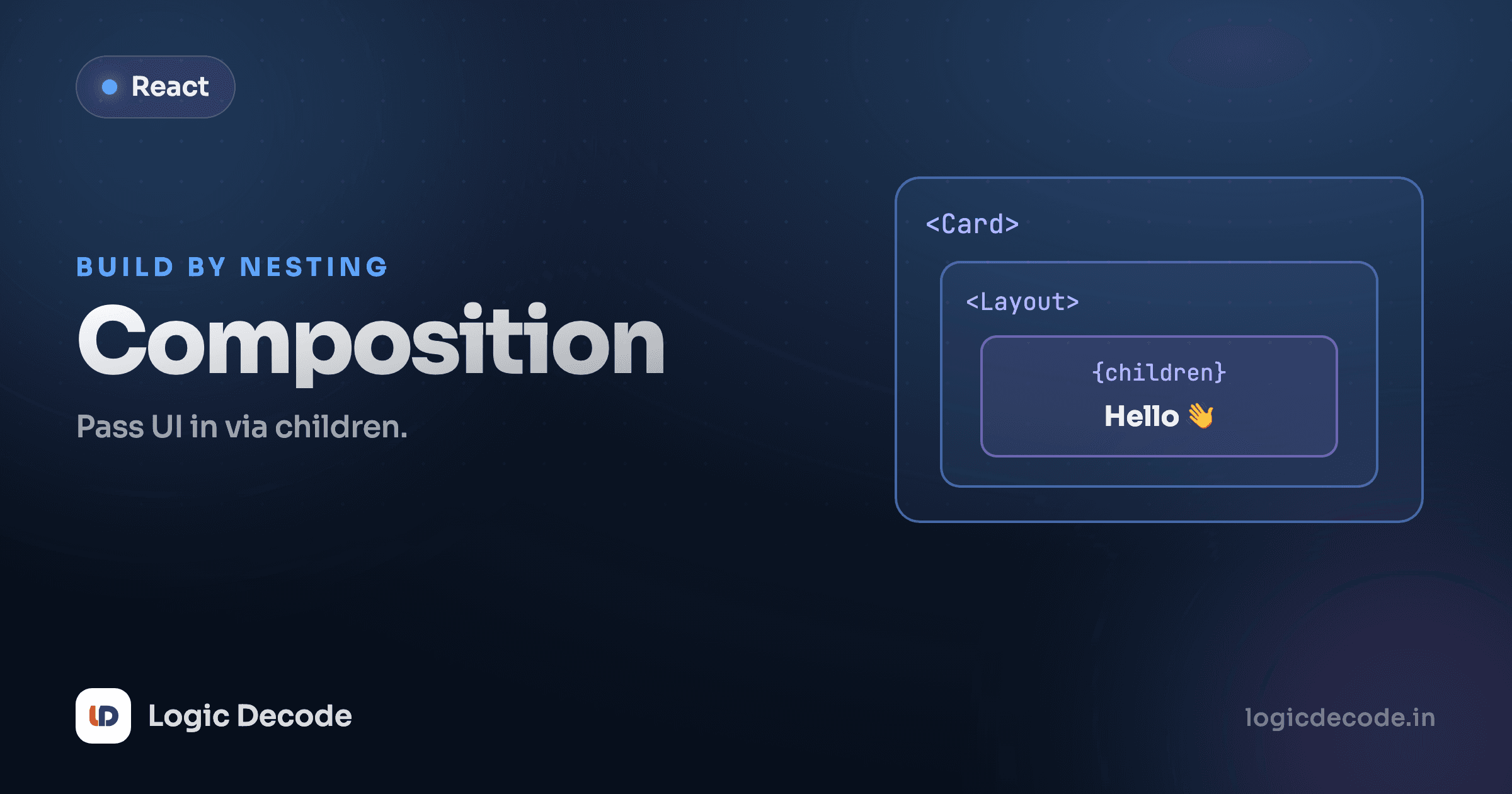
Here's a Card that doesn't try to guess what goes inside. It just provides the box.
Card knows nothing about profiles, titles, or paragraphs. It owns the border, the padding, the rounded corners, the box-ness. The caller decides what's inside by writing normal JSX between the tags. Want a card with an image and a price next time? Same Card, different children. You never edit Card again.
Compare that to the props-soup version: <Card title="Aarav's profile" subtitle="Joined March 2026" body="14 posts" />. The moment you need a second paragraph or a link inside the body, that API breaks and you're back adding props. The children version already handled it.
Slot props: more than one hole to fill
children is one slot. Real layouts need a few: a header, a body, a sidebar. You can pass JSX through named props, sometimes called slots, and place each one exactly where it belongs.
PageLayout defines the structure once: where the header sits, how wide the sidebar is, how they flex together. Every page reuses that frame and just fills the slots. JSX is a regular value here: you can pass an element through a prop exactly like you'd pass a string or a number. That's the key idea. A component can accept whole chunks of UI as input, not just data.
children is just a prop
<Card>hi</Card> is identical to <Card children="hi" />. React folds whatever sits between the tags into the children prop for you. Once that clicks, slot props stop feeling like magic. They're the same idea with a different name.
Composition over configuration
Here's the opinionated part. When you're deciding how a component should be flexible, prefer passing content over piling on flags.
A Button that takes primary, danger, large, iconLeft, iconRight, fullWidth, loading props is configuration. Every new need is a new prop and a new if inside the component. A Button that takes children and a small variant lets the caller compose: put the icon and the label in as children and you're done. Configuration grows the component. Composition grows at the call site, where the actual requirements live.
The rule I follow: if a prop's only job is to toggle a piece of markup on or off, that markup probably belongs in children or a slot instead. Reserve props for genuine data and behavior (variant, onClick, disabled) and let composition handle the shape of what's inside.
Lifting state up
Composition solves structure. Lifting state up solves a different problem: two sibling components that need to share data.
Say you've got a temperature input and a "too cold to swim?" warning. They're separate components, but the warning depends on what's typed in the input. State inside the input is private, so the sibling can't see it. The fix is to move that state up to their closest common parent and pass it down to both.
The state lives in App, the common parent. TempInput doesn't own the value anymore. It receives value and reports changes back up through onChange. Verdict receives the same temp and reacts to it. One source of truth, two components reading from it. Type in the box and both stay in sync automatically, because they're both fed by the same piece of state in App.
This is the core pattern: when two components need the same data, hoist it to the lowest parent they share, then pass it down. The official guide Sharing State Between Components walks through the exact reasoning, and it's worth reading slowly the first time.
Don't lift too high
Lifting is for shared state, not all state. Put state at the lowest common parent, no higher. A search box's text that nothing else reads should stay in the search box. Hauling every piece of state to the top creates the opposite mess: a giant root component re-rendering the world on every keystroke.
When state climbs so high that you're threading props through five layers of components that don't use them (a problem called prop drilling), that's your signal to reach for React Context instead. Lifting handles two or three siblings cleanly. Context handles "the whole subtree needs this."
When to split a component
Composition only pays off if your pieces are the right size, and "small" isn't the goal. Focused is. A 200-line component that does one coherent thing can be fine. A 40-line one juggling three unrelated jobs should split.
Honest signals it's time to break a component apart:
- You're scrolling to understand it. If you can't see the whole thing on one screen and hold it in your head, it's doing too much.
- It has unrelated state. A component tracking both form input and a fetch result and a modal's open/closed state is three components in a trenchcoat.
- A chunk has its own clear name. If you'd comment
{/* the comment section */}, that comment is begging to be a<Comments>component. - You're copy-pasting JSX. Repetition is the loudest signal of all. Extract it and pass the differences as props or children.
And the honest counter-signal: don't split just to split. Pulling out a one-line <Title> that's used once adds a file, an import, and a layer of indirection for nothing. Split when it reduces what you have to think about at once, not to hit some line count.
Quick check
A parent renders a price filter and a product list as siblings. The list must show only products within the filter's range. Where should the selected price range live?
Recap and what's next
Composition is how React code stays readable as it grows. Pass content through children and named slot props instead of inventing a prop for every variation. Let the call site decide what goes inside, and your components stop accumulating flags. When siblings need to share data, lift that state to their lowest common parent and pass it down, keeping one source of truth. Split components when they stop being focused, not to chase a line count. Master these and you'll feel the difference: features become adding small pieces, not editing fragile big ones.
You've now got the full toolkit for building React UIs. Time to use it on something real: build a todo app, where composition, lifted state, and everything else from this series come together into one project you can actually ship.

Written by
Rhythm Bhiwani
Engineer and relentless builder, happiest reverse-engineering hard problems until they click.
Enjoyed this?
Tap the heart to leave some love.
Be the first to react
Comments
Join the conversation.
Loading comments…