CSS Flexbox: One-Dimensional Layout, Explained
Master CSS Flexbox: main vs cross axis, justify-content, align-items, and flex-wrap, with an interactive playground to see it move.

You have three buttons and you want them in a row, evenly spaced, vertically centered. For years that meant float, clearfix hacks, and a lot of swearing. Flexbox is the tool that makes "put these things in a row and space them how I want" a two-line job. Add one property to the parent, and the children fall into line.
What Flexbox is actually for
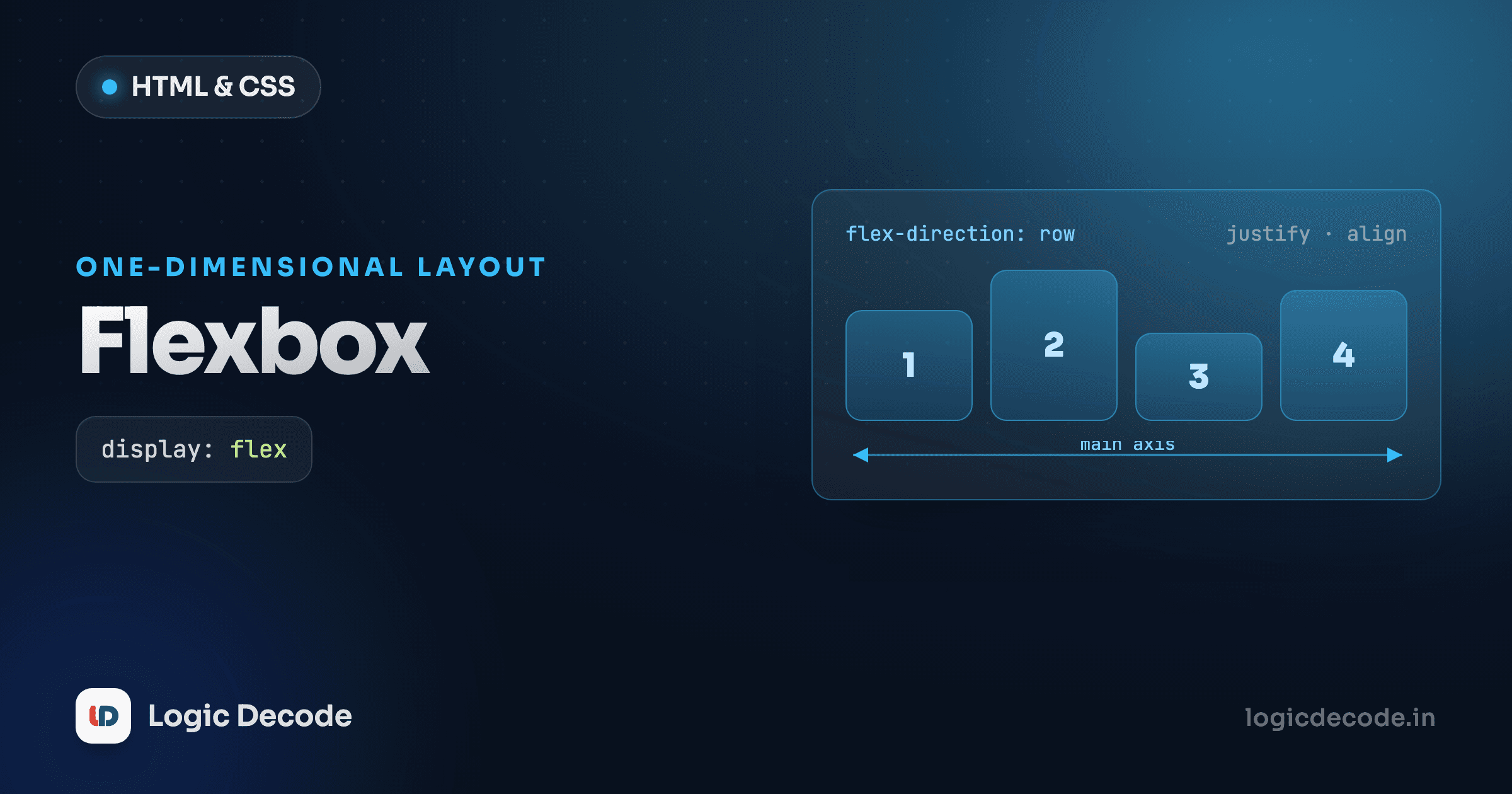
Flexbox is for laying out things in one direction at a time, a single row, or a single column. That's the whole mental model. If you're arranging items along one line and want control over spacing, alignment, and how they shrink or grow, Flexbox is the right tool. When you need rows and columns together as a real two-dimensional grid, that's a different job (CSS Grid, next lesson).
You turn it on by setting display: flex on the container. The element you put it on becomes the flex container. Its direct children become flex items, and they immediately start behaving differently.
.toolbar {
  display: flex;
}
That single line takes the toolbar's children and lays them out in a row. No floats, no inline-block whitespace gaps. Here's it working. Three boxes that were stacked are now side by side.
Try deleting display: flex in that playground and watch the buttons stack vertically again. That one line is doing all the work.
The two axes: main and cross
This is the idea everything else hangs off, so it's worth slowing down for. A flex container has two axes:
- The main axis runs in the direction your items flow. By default that's horizontal, left to right.
- The cross axis runs perpendicular to it. By default that's vertical, top to bottom.
Why does this matter? Because the two properties you'll reach for constantly (justify-content and align-items) each control a different axis. justify-content positions items along the main axis. align-items positions them along the cross axis. Mix those two up and nothing lines up the way you expect, and you'll sit there poking at the wrong property. Almost every "why won't this center" Flexbox question comes down to picking the axis wrong.
And here's the twist: the axes aren't fixed to horizontal and vertical. They flip based on flex-direction. Set the direction to a column and the main axis becomes vertical, so now justify-content controls the up-and-down spacing instead. The axes follow the direction, not the screen.
The fastest way to build the intuition is to grab the controls and watch the boxes move. Change one dropdown at a time and notice which way the boxes shift:
Flexbox playground
Spend a minute in there. Switch flex-direction to column and then change justify-content — see how it now moves the boxes vertically instead of horizontally? That flip is the single most important thing to internalize about Flexbox.
flex-direction: row or column
flex-direction sets which way the main axis points, and you've got four choices:
.container { flex-direction: row; }            /* default: left → right */
.container { flex-direction: row-reverse; }     /* right → left */
.container { flex-direction: column; }          /* top → bottom */
.container { flex-direction: column-reverse; }  /* bottom → top */
row is the default, which is why display: flex alone gives you a horizontal layout. Reach for column when you want a vertical stack with flex's alignment powers, like a sidebar's nav links or a card's stacked content. The -reverse variants flip the order without you having to reorder the HTML, handy for things like chat logs.
justify-content vs align-items
These are the two you'll type the most. Keep the axes from above in mind and they're simple.
justify-content distributes items along the main axis. The space-related values are the ones worth knowing:
.nav { display: flex; }
.nav { justify-content: flex-start; }    /* packed at the start (default) */
.nav { justify-content: center; }        /* packed in the center */
.nav { justify-content: space-between; } /* first & last pinned to edges, gaps equal */
.nav { justify-content: space-around; }  /* equal space around each item */
space-between is the workhorse for nav bars: logo on the far left, links on the far right, the browser figures out the gap. No magic margins.
align-items positions items along the cross axis. With a default row, that's vertical alignment:
.bar { display: flex; align-items: center; }   /* vertically center everything */
.bar { align-items: flex-start; }              /* align to the top */
.bar { align-items: stretch; }                 /* default: fill the height */
align-items: center is the answer to the old "how do I vertically center this" headache. One line.
The two-property cheat for centering
To center something both ways, set the container to display: flex then justify-content: center (main axis) and align-items: center (cross axis). Two properties, dead center, no negative margins or transforms.
Quick check
In a row-direction flex container, which property vertically centers the items?
gap: spacing without margin gymnastics
Old Flexbox tutorials are full of margin-right on every item except the last. Skip all that. gap sets the space between flex items directly on the container:
.toolbar {
  display: flex;
  gap: 12px;        /* 12px between every item, none on the outside edges */
}
It only adds space between items, never around the outer edges, which is exactly what you want most of the time. Use it everywhere.
flex-wrap: when one line isn't enough
By default, flex items stubbornly stay on one line. If there are too many, they shrink to fit rather than wrap. That's flex-wrap: nowrap. Often you want them to spill onto the next line instead, especially for cards on a narrow screen:
.cards {
  display: flex;
  flex-wrap: wrap;   /* items flow onto new lines when they run out of room */
  gap: 16px;
}
With wrap on, a row of cards becomes a responsive grid-ish layout that reflows as the window narrows, a real one-dimensional layout doing a passable two-dimensional impression. Resize the playground panel below and watch the cards drop to the next line:
flex: how items grow and shrink
Notice flex: 1 1 160px on the card above? That's the flex shorthand, set on the items (not the container), and it controls how each one sizes itself. It bundles three properties:
flex-grow: how greedily an item grabs leftover space (0= don't grow,1= take a share).flex-shrink: how willingly it gives up space when there's not enough (1= shrink,0= never shrink).flex-basis: the item's starting size before growing or shrinking (160px,auto,0…).
So flex: 1 1 160px reads as "start at 160px wide, but grow to fill extra space and shrink if you must." That's why the cards stretch to fill a wide row and reflow neatly when it gets tight. The two you'll use most:
.item { flex: 1; }      /* shorthand for 1 1 0 — equal columns that fill the row */
.sidebar { flex: 0 0 240px; }  /* fixed 240px, never grows or shrinks */
flex: 1 on several siblings splits the row into equal columns. flex: 0 0 240px pins a fixed-width sidebar next to a flexible main area. That combination (fixed sidebar, fluid content) is one of the most common layouts on the web, and it's two declarations.
A real navigation bar
Let's put it together. A header with a logo on the left and links on the right, everything vertically centered, is the canonical Flexbox job: space-between on the main axis, center on the cross axis.
Two flex containers nested: the outer .nav pushes the logo and link group to opposite ends with space-between and centers them vertically with align-items: center. The inner .links is its own little flex row spacing the anchors with gap. Nesting flex containers like this is normal and how most real layouts get built.
Recap and what's next
Flexbox is one-dimensional layout: display: flex turns a container on, items flow along the main axis (set by flex-direction), and justify-content spaces them along that axis while align-items lines them up on the cross axis. gap handles spacing, flex-wrap lets items spill onto new lines, and the flex shorthand (flex-grow flex-shrink flex-basis) decides how each item sizes itself. Get the axis idea straight and the rest is just picking values. For the full reference, MDN's basic concepts of flexbox is the page to bookmark.
It builds on the spacing and sizing ideas from CSS colors, units and typography. Next we step up to two dimensions, rows and columns at the same time, with CSS Grid, the other half of modern layout.

Written by
Rhythm Bhiwani
Engineer and relentless builder, happiest reverse-engineering hard problems until they click.
Enjoyed this?
Tap the heart to leave some love.
Be the first to react
Comments
Join the conversation.
Loading comments…