Build a Responsive Card Layout with CSS Grid
A hands-on CSS project: build a responsive card grid that reflows on any screen using Grid and modern CSS, fully editable in your browser.


A card grid is the most-built layout on the web. Product listings, blog rolls, dashboards, team pages, they're all the same shape: a set of boxes that sit in neat rows on a wide screen and stack into a single column on a phone. The lazy way to build that is a pile of media queries, one breakpoint per screen size, each one re-jiggering the column count. The good way is about three lines of CSS Grid and zero media queries. We're going to build the good way, live, and you'll edit it as we go.
What we're building
Here's the finished thing. Drag the bottom-right corner of the preview (or just resize the panel) and watch the cards reflow on their own: three across, then two, then one, with no breakpoints written anywhere.
That's the whole thing. The rest of this post is just walking through why each decision earns its place, because the magic is mostly hidden in one line.
The one line that does the work
Strip everything else away and the entire responsive behaviour lives here:
.grid {
  display: grid;
  grid-template-columns: repeat(auto-fit, minmax(240px, 1fr));
  gap: 20px;
}
Read repeat(auto-fit, minmax(240px, 1fr)) from the inside out. minmax(240px, 1fr) says each column is at least 240px wide and at most one equal share of the leftover space. So a column never gets skinnier than 240px, but when there's room to spare, every column grows to fill it evenly.
Then auto-fit decides how many of those columns to make. The browser fits as many 240px-minimum columns as the container allows, then stretches them to share the row. On a 1100px container you get four columns. Squeeze it to 600px and there's only room for two. Down at phone width, one. You never named those numbers. The browser did the arithmetic for you, on every resize, for free.
That's the headline of this lesson: the column count is a result, not a setting. You declare a minimum card width and let the grid figure out the rest.
auto-fit vs auto-fill
There's a near-twin called auto-fill. The difference only shows up when you have few items and lots of space. auto-fit collapses the empty tracks so your cards stretch to fill the row, while auto-fill keeps the empty tracks reserved, leaving gaps on the right. For a card grid you almost always want auto-fit, with items that grow to use the space instead of clustering on the left. If a single card stretching full-width looks odd to you, that's auto-fit doing its job. Cap it with a max-width on the card.
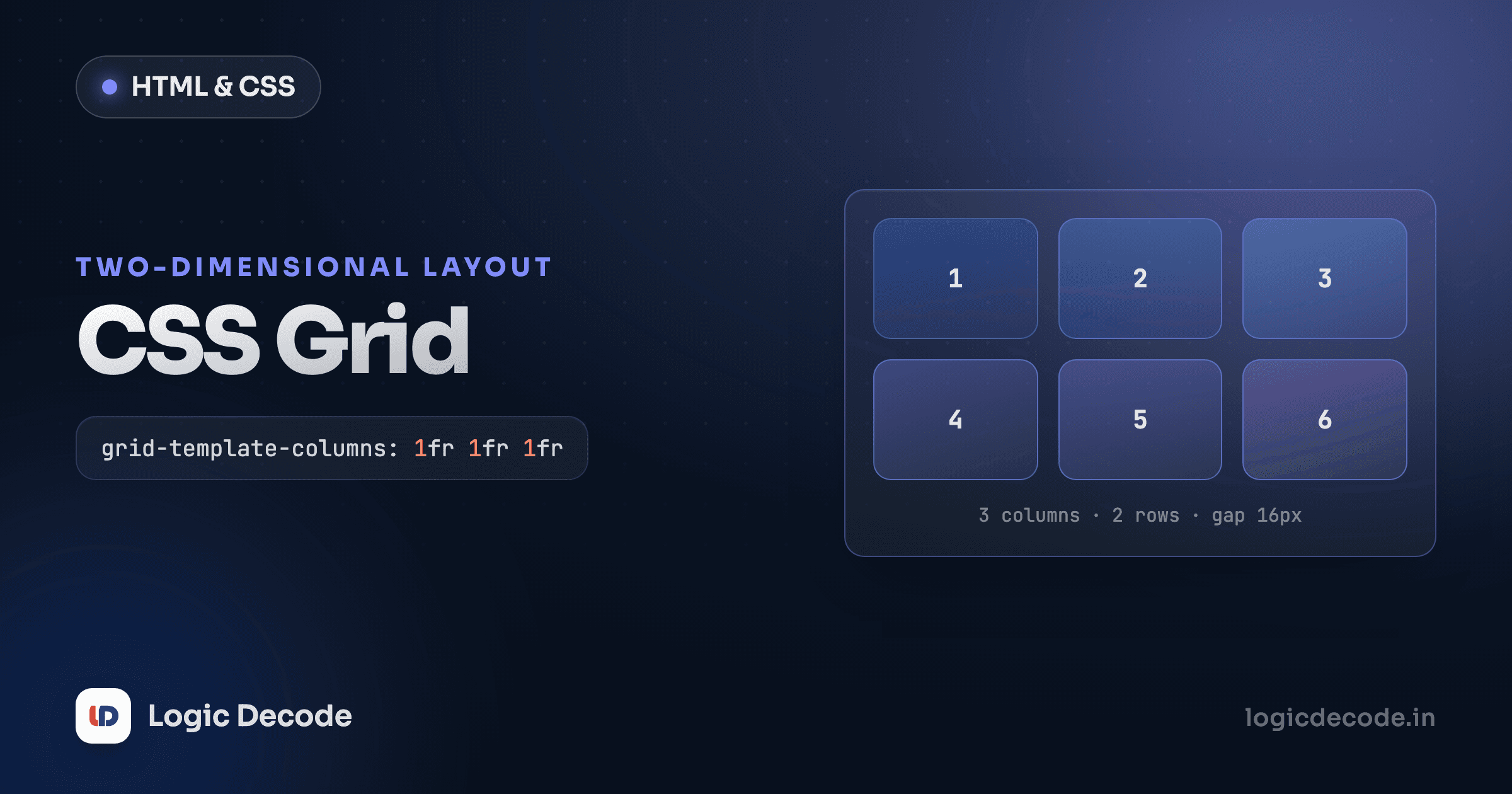
We covered the mechanics of tracks, fr units, and gap in depth in CSS Grid. If 1fr or minmax feel shaky, that's the post to revisit. Here we're putting them to work.
Quick check
With grid-template-columns: repeat(auto-fit, minmax(240px, 1fr)), what decides how many columns appear?
Why gap instead of margins
Notice there isn't a single margin on the cards. Spacing between them comes entirely from gap: 20px on the grid.
This matters more than it looks. The old way was margins on each card, which means fighting the edges: the first card in a row has unwanted space on its left, the last one on its right, and you end up writing :first-child / :last-child rules or negative margins on the container to claw it back. gap only puts space between tracks, never on the outer edges. It's the difference between aligning a layout and constantly nudging it. Set it once, forget it.
The card itself
A card is a tiny self-contained layout. Here's everything that makes one feel like a card:
.card {
  background: #1e293b;
  border: 1px solid #334155;
  border-radius: 14px;
  overflow: hidden;
  transition: transform 0.18s ease, box-shadow 0.18s ease;
}

.card:hover {
  transform: translateY(-4px);
  box-shadow: 0 12px 28px rgba(0, 0, 0, 0.45);
}
Three things are quietly important. border-radius rounds the card, but the image would poke square corners out past it, so overflow: hidden on the card clips the image to match. Without that one line your rounded corners only round three of the four. The padding lives on the inner .body, not the card, so the image can run edge to edge while the text stays comfortably inset.
The :hover lift is two properties: translateY(-4px) nudges the card up, and a bigger, softer box-shadow makes it feel like it's floating off the page. The transition on the base .card is what makes that smooth instead of a snap, and putting it on the base rule (not the :hover) means it animates both on the way in and on the way out. We dug into the timing of this in CSS transitions and animations, but the short version is: animate transform and opacity, not top or width, because the browser can do those on the GPU without re-laying-out the page.
Respect people who get motion-sick
A hover lift is harmless, but bigger animations should back off for users who've asked them to. Wrap motion in @media (prefers-reduced-motion: no-preference) { … } so it only runs for people who haven't requested reduced motion. It's one media query that makes your site usable for a real group of people.
Don't skip the images
The cards use real <img> tags, and two attributes on them are doing accessibility and performance work:
<img
  src="https://picsum.photos/seed/dunes/640/360"
  alt="Wind-rippled sand dunes at dawn"
  width="640"
  height="360"
/>
The alt text describes the picture for anyone using a screen reader, and shows up if the image fails to load. Write what's in the photo, not "image of a card". Useless alt text is barely better than none. The width and height attributes let the browser reserve the right space before the image downloads, so the page doesn't jolt as pictures pop in. That jolt has a name, Cumulative Layout Shift, and it's one of the things Google measures.
In the CSS, aspect-ratio: 16 / 9 plus object-fit: cover is the modern trick for uniform thumbnails. The cards all have different source dimensions, but every image is forced into a 16:9 box and cropped to fill it, with no stretching and no letterboxing. aspect-ratio is one of those newer properties that quietly killed a whole genre of padding hacks. We rounded up a few more like it in Modern CSS features.
Where media queries still fit
So did we really build a responsive layout with zero media queries? For the grid, yes, and that's the point of auto-fit + minmax. The grid adapts on its own.
But media queries didn't die. They just have a smaller job now. You'd still reach for one to bump up the gap on huge screens, shrink the page padding on tiny ones, or change a font size at a breakpoint. The shift in thinking is this: let the layout flex intrinsically wherever you can, and use responsive design media queries only for the handful of tweaks that genuinely need a hard cutoff. Most card grids need none.
Make it yours
The playground at the top is yours to wreck. A few directions worth trying:
- Change the minimum. Drop
240pxto180pxand you'll fit more, narrower cards. Push it to320pxfor fewer, roomier ones. That single number is your whole responsive strategy. - Cap the columns. Don't want more than three across on a giant monitor? Wrap the grid in a
max-widthcontainer (the demo uses 1100px). Simplest lever there is. - Add a featured card that spans two columns with
grid-column: span 2;and watch it slot in. - Swap the hover for a border-colour change or a gentle
scale(1.02)instead of the lift. - Make the cards equal height with content of different lengths. They already are, because grid tracks stretch to the tallest item in the row. Try adding a longer paragraph and see.
You now have the pattern behind nearly every grid of things on the web: declare a minimum card size, let auto-fit and minmax choose the column count, space with gap, and dress each card with border-radius, a clipped image, and a transform-based hover. MDN's Realizing common layouts using grids is the reference to keep open as you push it further.
Next we take everything from this whole series (the box model, Flexbox, Grid, and these modern properties) and build a full page from scratch: Build a responsive landing page.

Written by
Rhythm Bhiwani
Engineer and relentless builder, happiest reverse-engineering hard problems until they click.
Enjoyed this?
Tap the heart to leave some love.
Be the first to react
Comments
Join the conversation.
Loading comments…