CSS Transitions and Animations, Explained
Add motion with CSS: transitions, transforms, and keyframe animations done tastefully and accessibly, with a live, editable preview you can edit.

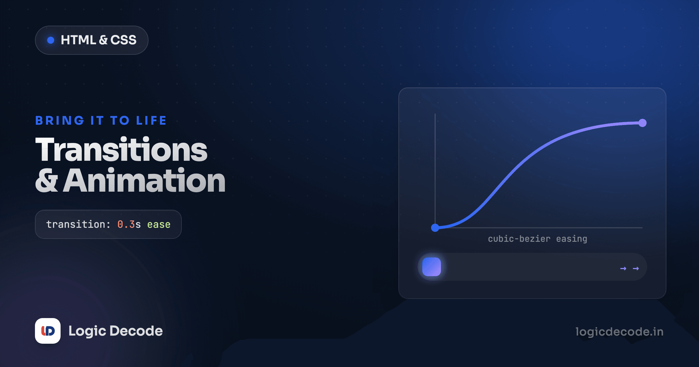
A button that snaps from grey to blue feels cheap. The same button easing from grey to blue over 150 milliseconds feels built. That gap is motion, and CSS gives you two ways to get it: transitions for state changes you trigger (hover, focus, a toggled class) and keyframe animations for movement that runs on its own. You write a few lines, the browser does the in-between frames, and nothing about your JavaScript changes.
A transition in four words
Hover the box below. It moves, grows, and changes colour, all because one line tells the browser "don't jump between these values, slide."
The whole trick lives in the transition line, and it has four parts:
- property is what to animate (
transform,background). Useallto catch everything, but naming the properties is faster and avoids surprise animations. - duration is how long, in
sorms. Under ~250ms feels snappy. Much longer and the UI feels sluggish. - timing-function is the speed curve.
ease-out(fast then slow) is the safe default for things entering or reacting to a click.linearlooks robotic for most UI. - delay is an optional wait before it starts.
The element has two states: its normal look and its :hover look. The transition sits on the base rule and animates both directions (into hover and back out) so you write it once. Move it onto .card:hover instead and you'd get a smooth entrance and an ugly snap on exit. The MDN guide to using CSS transitions is the reference worth bookmarking once this clicks.
Transition the base, not the state
Put transition on the resting selector (.card), not on .card:hover. On the base rule it covers entering and leaving the state. On the hover rule it only fires on the way in, and the mouse-out snaps.
Why transform is the property you reach for
Notice the box above moved with transform: translateY(...) instead of top or margin. That's not a style choice, it's a performance one.
When you animate something like width, top, or margin, the browser has to recompute layout (where every nearby element sits) on each frame. That's expensive, and on a busy page it stutters. But transform and opacity are handled separately, after layout, often on the GPU. The browser can shove pixels around without re-measuring the page, so they stay smooth even on cheap phones.
So the rule of thumb: animate transform and opacity, avoid animating layout properties. Most motion you want maps cleanly onto transforms:
.thing {
  transform: translateX(20px);   /* slide right */
  transform: translateY(-6px);   /* nudge up */
  transform: scale(1.1);         /* grow to 110% */
  transform: rotate(8deg);       /* tilt */
}
You can chain them in one value. transform: translateY(-6px) scale(1.05) does both at once, which is exactly what the hover demo used. Order matters a little (rotate-then-translate differs from translate-then-rotate), so eyeball the result.
Quick check
Which pair of properties is cheapest to animate smoothly?
Keyframes: motion that runs on its own
Transitions need a trigger, since a state has to change. When you want something to move by itself, like a loading spinner or a pulse, you describe the steps with @keyframes and attach them with the animation property.
A keyframes block is a named timeline. You set the values at points along it (from/to, or percentages), and the browser fills in everything between.
The animation shorthand stacks up like the transition one: animation: spin 800ms linear infinite reads as name, duration, timing-function, iteration-count. A few values do most of the work:
infiniteloops forever. A number like3runs it three times.alternateplays the timeline forward then backward, so a two-keyframe animation can breathe without you writing the return trip.ease-in-outsuits a pulse (slow at both ends), andlinearsuits a spinner (constant speed).
The spinner only needs a to step because from is just the element's current state (no rotation). The pulse uses 0% / 50% / 100% to grow and shrink, and because both transformed properties are transform and opacity, it stays smooth.
Don't animate everything
Looping animations pull the eye and never let it rest. One spinner on a loading state is fine. A page where the heading pulses, the buttons bounce, and the icons rotate is a page nobody can read. Motion is punctuation, not paragraphs.
Accessibility: respect prefers-reduced-motion
Here's the part most tutorials skip. Some people get dizzy, nauseous, or worse from on-screen motion. Vestibular disorders are common, and those users set "reduce motion" in their OS. The browser exposes that choice as a media query, and ignoring it is a real accessibility failure, not a nicety.
Wrap your motion so it backs off when asked:
/* Motion on by default */
.card {
  transition: transform 200ms ease-out;
}
.card:hover {
  transform: translateY(-6px);
}

/* …but cut it for anyone who opted out */
@media (prefers-reduced-motion: reduce) {
  .card {
    transition: none;
  }
  .card:hover {
    transform: none;
  }
}
A blunt version that catches the whole page in one rule:
@media (prefers-reduced-motion: reduce) {
  *,
  *::before,
  *::after {
    animation-duration: 0.01ms !important;
    animation-iteration-count: 1 !important;
    transition-duration: 0.01ms !important;
  }
}
That global block is worth keeping in your base stylesheet. It makes "respect the setting" the default for the whole site, and you only override it where a specific animation genuinely carries meaning. Test it by flipping "reduce motion" in your system settings and reloading. The spinner should stop spinning, the hover should stop hopping.
Quick check
What's the right way to handle a user who has 'reduce motion' enabled?
What to take away
Transitions animate a change you trigger. Set transition on the base rule, name the property, keep it under a quarter-second, and let it cover both directions. Keyframe animations run on their own. Describe the steps with @keyframes, attach them with animation, and reach for infinite or alternate when you need looping or back-and-forth. Animate transform and opacity so the browser can stay at 60fps, and gate everything behind prefers-reduced-motion so the people who need stillness get it.
You came here from CSS positioning and z-index. Next up, the modern toolbox that makes a lot of old CSS hacks obsolete: modern CSS features, covering container queries, :has(), nesting, and friends.

Written by
Rhythm Bhiwani
Engineer and relentless builder, happiest reverse-engineering hard problems until they click.
Enjoyed this?
Tap the heart to leave some love.
Be the first to react
Comments
Join the conversation.
Loading comments…