
Responsive Web Design with CSS Media Queries
Make pages work on any screen: mobile-first CSS, media queries, fluid units, and responsive images, with a live, editable preview.

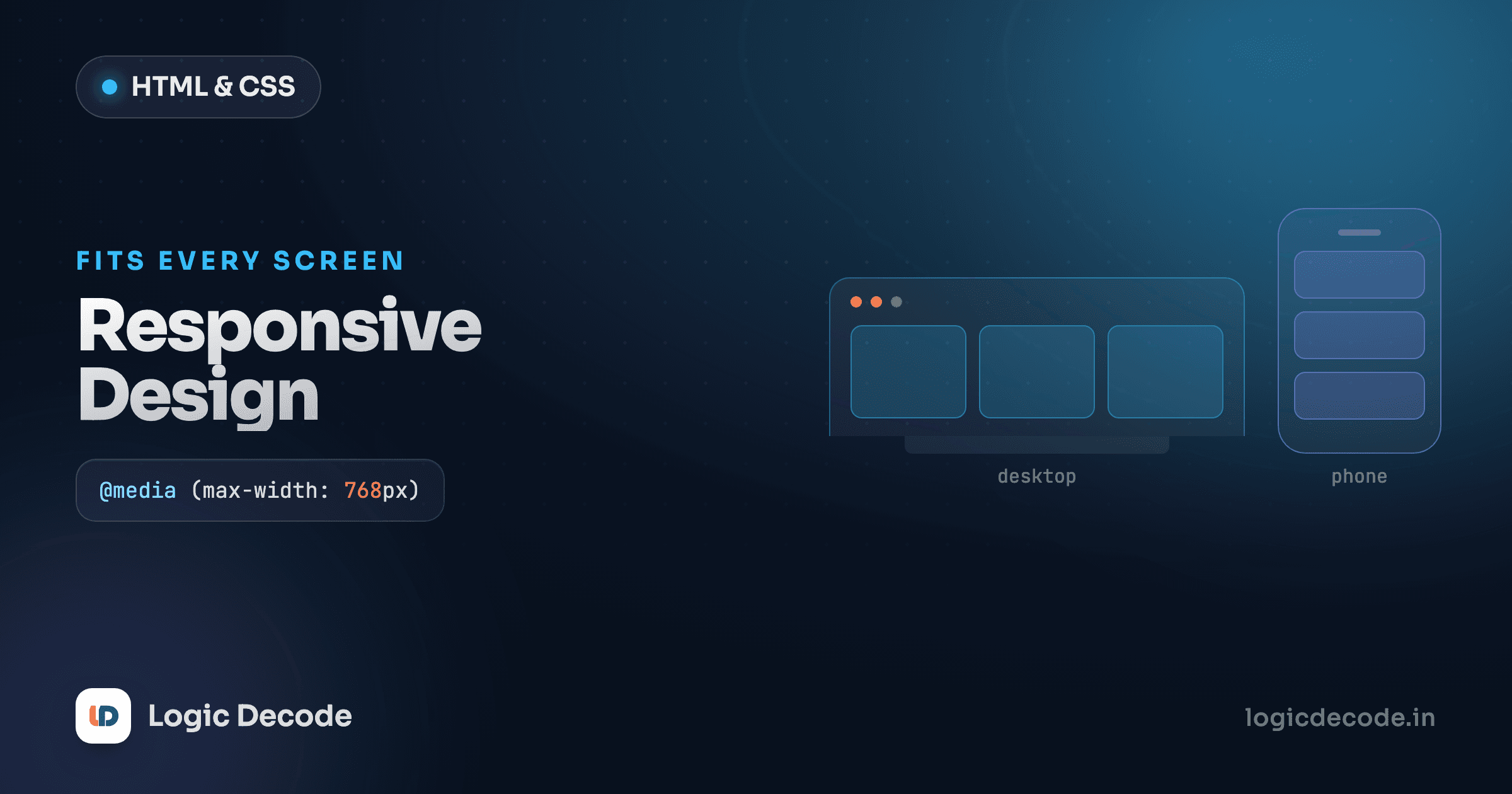
Resize a well-built page on your phone and the columns stack, the text stays readable, and nothing spills off the edge sideways. That's not luck. It's a handful of CSS techniques that let one stylesheet adapt to a 360px phone and a 1440px monitor without you shipping two sites. This lesson covers the core of it: the viewport tag, mobile-first thinking, media queries, fluid units, and images that don't blow out their container.
Here's a layout that already does the right thing. Make the preview narrow and watch the two columns collapse into one.
Drag the preview's edge in and out. Below 600px wide you get one column. At 600px and up, two. That one @media block is the whole trick, and the rest of this lesson is about doing it deliberately.
The viewport meta tag is not optional
Before any CSS matters, you need this line in your <head>:
<meta name="viewport" content="width=device-width, initial-scale=1" />Leave it out and phones lie about their width. By default a mobile browser pretends the screen is around 980px wide and then shrinks the whole rendered page to fit, so your carefully responsive CSS never triggers. The browser thinks it's on a desktop and just zooms out. The result is a tiny, unreadable page the user has to pinch to zoom.
width=device-width tells the browser to use the device's actual width (360px on a typical phone), and initial-scale=1 says don't zoom on load. With that one line, media queries start firing on the sizes they should. Every responsive page begins here.
If your media queries seem ignored on mobile
Nine times out of ten it's the missing viewport tag. Add it before you debug anything else.
Mobile-first: base styles, then grow
You have two ways to write breakpoints, and the order matters more than people expect.
Desktop-first writes the big layout as the default, then uses max-width queries to shrink things down. Mobile-first writes the single-column phone layout as the default, then uses min-width queries to add complexity as the screen grows. Mobile-first wins, and not just on principle.
The base styles (the ones outside any media query) are what a browser loads first and what every device gets. Make those the simplest case (one column, full-width, stacked) and the small, constrained device gets the least work. Then each min-width query adds rather than overrides, so your CSS reads as "here's the simple version, and here's what changes when there's more room." That's the pattern in the first example: grid-template-columns: 1fr is the default, and the 600px query upgrades it to two columns.
/* base: applies everywhere, designed for small screens */
.nav { display: flex; flex-direction: column; }

/* enhancement: only when there's room */
@media (min-width: 600px) {
  .nav { flex-direction: row; }
}
Reading top to bottom, you build up. The opposite approach (start wide, then claw it back with max-width) tends to pile up overrides and gets tangled fast.
Media query syntax and breakpoints
A media query is a condition wrapped around a block of CSS. The rules inside apply only when the condition is true.
@media (min-width: 768px) {
  /* applies when the viewport is 768px wide or wider */
  .sidebar { display: block; }
}

@media (min-width: 768px) and (max-width: 1023px) {
  /* a band: tablets only */
  .grid { grid-template-columns: 1fr 1fr; }
}
You can combine conditions with and, test for min-width and max-width, and even query orientation ((orientation: landscape)) or user preferences like (prefers-reduced-motion: reduce). The MDN guide to using media queries is the reference worth keeping a tab on.
About breakpoints: pick them for your content, not for specific phones. There's no canonical list of device widths to match, and chasing "the iPhone breakpoint" is a trap. There are hundreds of screen sizes and they change every year. The honest method is to resize your page and add a breakpoint at the exact width where the layout starts to look cramped or stretched. That said, values around 600px, 768px, and 1024px are common starting points because real content tends to break near there.
Don't hard-code device sizes
@media (max-width: 375px) to "target the iPhone" is fragile. It breaks the moment a phone ships with a different width, which is constantly. Let the content tell you where to break. Test by dragging the window, not by naming devices.
Quick check
In a mobile-first stylesheet, what does the CSS outside any media query describe?
Fluid units and clamp()
Media queries make jumps. At 600px the layout snaps to two columns. But a lot of responsiveness should be smooth, scaling gradually with the screen instead of jumping at thresholds. That's what fluid units are for.
%, vw (1% of viewport width), and vh (1% of viewport height) flex with their context. A width: 100% element fills its parent at any size. Font sizes set in rem scale with the user's preferred base size, which respects their accessibility settings — use rem for type, not fixed px.
The real workhorse is clamp(). It takes three values, a minimum, a preferred (usually fluid), and a maximum, and gives you something that scales but never gets absurd:
h1 {
  /* never smaller than 1.5rem, never bigger than 3rem,
     and 5vw in between */
  font-size: clamp(1.5rem, 5vw, 3rem);
}

.container {
  width: clamp(20rem, 90vw, 70rem);
  margin-inline: auto;
}
That heading grows with the viewport but stays legible on a phone and stops bloating on a wide monitor, often replacing two or three media queries with one line. Try it live; widen and narrow the preview and watch the title resize on its own:
Responsive images
One image can quietly break your whole layout: drop a 2000px-wide photo into a 360px phone and it shoves the page sideways, creating that horizontal scroll nobody wants. The fix is one rule you should set globally:
img {
  max-width: 100%;
  height: auto;
}
max-width: 100% says the image may be its natural size but never wider than its container, so it shrinks to fit. height: auto keeps the aspect ratio so it never squashes. This handles the vast majority of cases.
When you need to go further (serving a smaller file to phones to save bandwidth, not just visually shrinking a huge one), HTML's srcset and sizes attributes and the <picture> element let the browser pick the right image. That's worth learning once you care about performance, but max-width: 100% is the rule that stops images from breaking layouts, and it should be in every stylesheet you write.
A useful debugging trick
Horizontal scroll on mobile usually means one element is wider than the viewport, often an image, a fixed width in px, or a long unbroken string. Temporarily add * { outline: 1px solid red; } and the overflowing box lights up immediately.
A note on container queries
Media queries respond to the viewport, the whole window. But sometimes a component needs to respond to the space it sits in, not the page. A card in a narrow sidebar and the same card in a wide main area want different layouts even at the same viewport width. That's what container queries do, and they change how you build reusable components. We dig into them in the modern CSS features lesson. For now, just know media queries aren't the only tool for "respond to size."
Recap and what's next
Responsive design is a small set of habits, not a framework. Start with the viewport meta tag or nothing else works. Write mobile-first: simple base styles, then min-width media queries that add complexity as the screen grows. Pick breakpoints from your content, never from a list of device sizes. Reach for fluid units and clamp() to scale smoothly between breakpoints, and put max-width: 100% on your images so they never break the layout.
You came in from CSS Grid, and grid plus media queries is most of what responsive layout actually is. Next we tackle stacking and overlap: CSS positioning and z-index, where you'll learn to pin headers, layer elements, and stop fighting position: absolute.

Written by
Rhythm Bhiwani
Engineer and relentless builder, happiest reverse-engineering hard problems until they click.
Enjoyed this?
Tap the heart to leave some love.
Be the first to react
Comments
Join the conversation.
Loading comments…