
CSS Selectors and the Box Model, Explained
How CSS selectors target elements and how the box model (margin, border, padding, content) controls size, with editable live examples.

CSS is two questions, over and over: which elements do I want to style, and how big should they be? Selectors answer the first. The box model answers the second. Get comfortable with both and most of CSS stops feeling like guesswork. You'll know why a paragraph is suddenly 40px wider than you wanted, and you'll know exactly which rule to write to fix it.
Let's start by hooking some CSS onto a page, then change one rule and watch it land.
Change rebeccapurple to teal, or bump the padding, and the preview reacts instantly. That's the whole loop you'll live in for the rest of this series.
Three ways to add CSS (use the last one)
You can attach styles three ways, and only one of them is the right default.
<!-- 1. Inline: on the element itself. Avoid except for quick tests. -->
<p style="color: red;">Hard to reuse, hard to override.</p>

<!-- 2. Internal: a <style> block in the page <head>. Fine for one-offs. -->
<style>
  p { color: red; }
</style>

<!-- 3. External: a separate .css file. This is the one you want. -->
<link rel="stylesheet" href="styles.css" />
Reach for an external stylesheet almost every time. One file styles every page that links it, the browser caches it so repeat visits are faster, and your HTML stays about content while your CSS stays about looks. Inline styles are the worst of the three. They can't be reused, they're a pain to override, and they bury styling logic inside your markup. Keep them for a five-second experiment and nothing more.
Selectors: how you target elements
A CSS rule is a selector plus a block of declarations. The selector picks the elements, and the block says what to do with them.
selector {
  property: value;
}
There are a handful of selectors that cover the vast majority of real work.
/* Element selector — every <p> on the page */
p { line-height: 1.6; }

/* Class selector — every element with class="card" */
.card { border-radius: 8px; }

/* ID selector — the single element with id="header" */
#header { position: sticky; }

/* Descendant selector — <a> tags anywhere inside <nav> */
nav a { text-decoration: none; }

/* Grouping — apply the same rule to several selectors at once */
h1, h2, h3 { font-family: Georgia, serif; }
Classes are your bread and butter. They're reusable (put class="card" on ten elements and they all get the styling), and you can stack several on one element: class="card card--featured". The descendant selector (two selectors separated by a space) means "the second thing, but only when it's inside the first," which is how you style links in your nav differently from links in your footer without touching the markup.
Pseudo-classes: styling a state
A pseudo-class targets an element in a particular state rather than by name. The one you'll use constantly is :hover.
Hover the button and the background darkens. Same idea powers :focus (an input the user has clicked or tabbed into), :first-child, :last-child, and :nth-child(). No JavaScript needed, because CSS handles these states on its own.
A word on specificity
When two rules target the same element, the more specific one wins. The rough ranking: inline styles beat IDs, IDs beat classes, classes beat element selectors. The practical takeaway: lean on classes, not IDs. An ID like #header is so specific that overriding it later means an even more specific selector (or the dreaded !important). Style with classes and your CSS stays easy to layer and override.
Quick check
Two rules target the same element: a class selector .title and an ID selector #main-title. Which one wins?
The box model: every element is a box
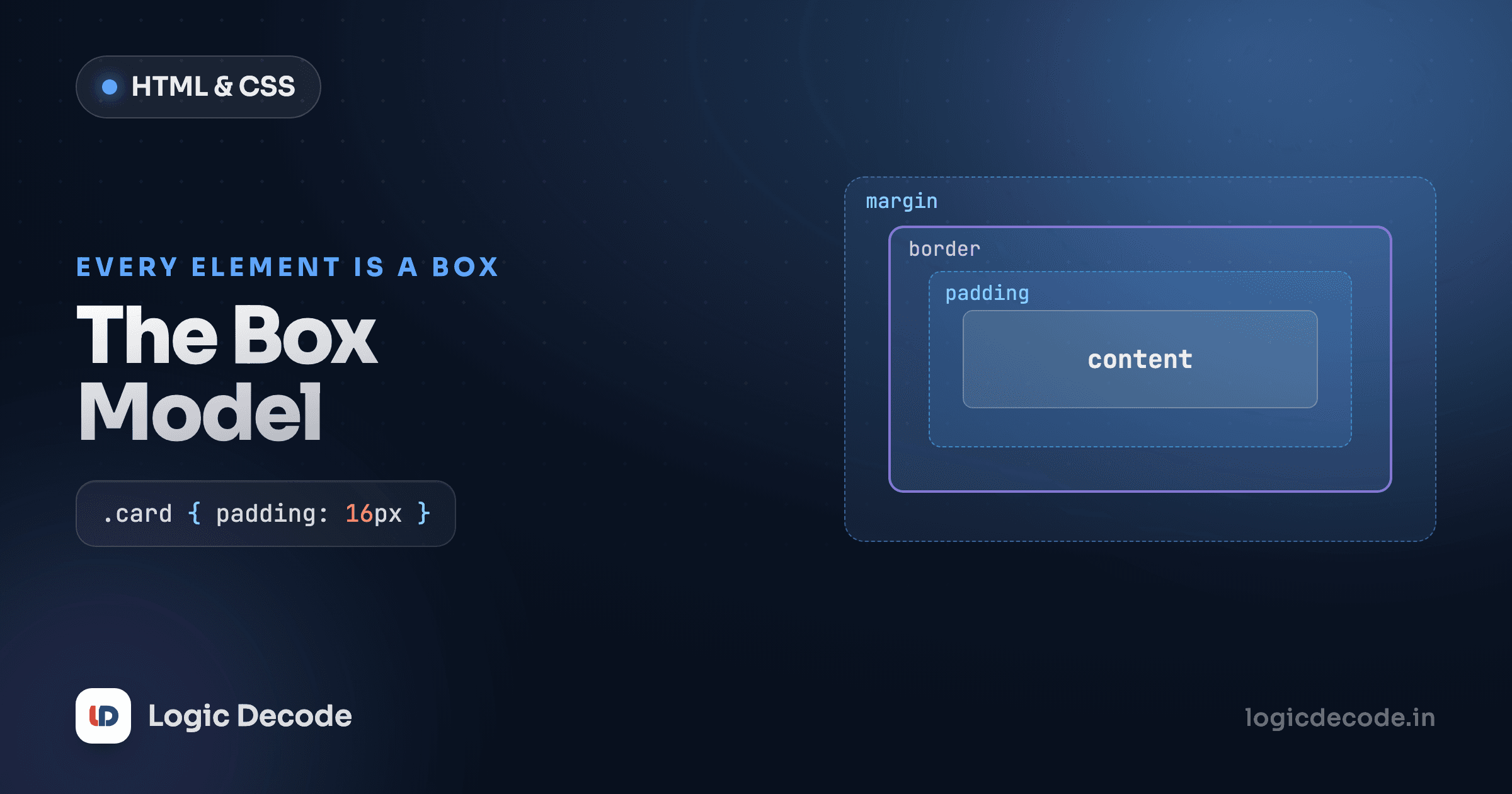
Here's the idea that explains half the "why is this the wrong size?" moments in CSS. Every element the browser renders is a rectangular box made of four layers, from the inside out:
- Content: the text or image itself, sized by
widthandheight. - Padding: space inside the box, between the content and the border. Padding takes the background color.
- Border: a line drawn around the padding.
- Margin: space outside the box, pushing other elements away. Always transparent.
Think of a framed photo: the picture is the content, the mat around it is the padding, the frame is the border, and the gap you leave between this frame and the next one on the wall is the margin.
Try this: change padding to 40px and watch the box grow inward (more breathing room around the text). Then change margin to 40px and watch the gap between the two boxes grow instead. Padding is inside, margin is outside, and that's the distinction people mix up most.
You can also set each side on its own. padding: 10px 20px; is shorthand for top/bottom 10px, left/right 20px. The longhand is padding-top, padding-right, padding-bottom, padding-left. Same pattern for margin and border.
box-sizing: border-box (turn this on, always)
Now the part that genuinely surprises people. By default, width sets the size of the content only, and padding and border get added on top. So this box:
.box {
  width: 200px;
  padding: 20px;
  border: 4px solid black;
}
…is not 200px wide on screen. It's 200 + 20 + 20 + 4 + 4 = 248px. The browser quietly added your padding and border to the width you asked for. This is the default behavior, called content-box, and it's a constant source of layouts that overflow by a few pixels.
The fix is one property: box-sizing: border-box. With it, width includes padding and border, so a box you declare as 200px actually measures 200px on screen, with padding and border eating into that space instead of inflating it.
Both boxes ask for width: 200px, but the first one bulges out wider because padding and border are tacked on. The second behaves the way you'd expect. This is why nearly every real project starts its stylesheet with one rule that flips border-box on for everything:
*,
*::before,
*::after {
  box-sizing: border-box;
}
I put that at the top of every stylesheet I write, and I'd suggest you do too. It makes width mean what you think it means, and sizing stops fighting you.
One more box-model quirk: collapsing margins
Vertical margins between two stacked block elements don't add up. They collapse to the larger of the two. If one box has margin-bottom: 20px and the next has margin-top: 30px, the gap between them is 30px, not 50px. It catches everyone once, but now it won't catch you.
width, height, and the gotcha to remember
width and height set the content size of a box. Most of the time you'll set width and let height figure itself out from the content, because fixing a height often clips text when it overflows. Useful values:
width: 300px;sets a fixed size.width: 50%;is half the width of the parent.max-width: 600px;is a cap, so the box never gets wider than 600px but can shrink below it. This is the workhorse for readable, responsive content.
A pattern you'll reuse endlessly: max-width plus margin: 0 auto to center a block horizontally inside its parent.
.container {
  max-width: 600px;
  margin: 0 auto;   /* 0 top/bottom, auto left/right = centered */
}
The browser splits the leftover horizontal space evenly on both sides, which centers the box.
Recap and what's next
Selectors pick elements (element, class, ID, descendant, grouping, and pseudo-classes like :hover), and you should reach for classes by default to keep specificity low and your styles easy to override. The box model says every element is content wrapped in padding, border, and margin. padding is inside, margin is outside, and box-sizing: border-box makes width include padding and border so your sizes behave. If you only remember one rule from this lesson, make it the universal border-box reset. For the full mental model with diagrams, the MDN box model guide is the canonical reference.
You came here from HTML forms and inputs. Next up we make these boxes look good with CSS colors, units and typography: hex vs rgb, when to use rem over px, and how to set readable type.

Written by
Rhythm Bhiwani
Engineer and relentless builder, happiest reverse-engineering hard problems until they click.
Enjoyed this?
Tap the heart to leave some love.
Be the first to react
Comments
Join the conversation.
Loading comments…